Project overview
Bluesky is a decentralized microblogging platform that positions itself as an alternative to X/Twitter and gives users more agency over what they see through customizable feeds instead of a single, opaque algorithm. In ENGL 4369, I was asked to evaluate the existing Bluesky mobile app and then design a prototype that improves the user experience for a specific audience.
My redesign focuses on casual users like community organizers and advocates who want a safe, customizable social platform but don’t have time to learn developer tools or read technical documentation. In particular, I targeted three problem areas I found in my evaluation: confusing feeds, scattered navigation, and an underemphasized alt text feature.
- Type: Upper-division UX course project
- Duration: One semester
- Deliverables: App evaluation, persona, user flow, and interactive Figma prototype
Problem & goals
In my initial analysis, I identified two primary audiences for Bluesky: everyday microblogging users migrating from X, and technically inclined users who are excited about decentralized infrastructure. The existing app leans heavily toward the second audience: features like custom feeds and external documentation assume a high level of technical comfort.
Key problems
- Feeds are powerful but opaque. Custom feeds are Bluesky’s core feature, but there is little in-app explanation of what a feed is, how to follow one, or where to discover more than the top few options.
- Navigation is inconsistent. The app mixes vertical and horizontal scrolling, hides help content behind a hamburger menu and external link, and splits feed discovery across multiple locations.
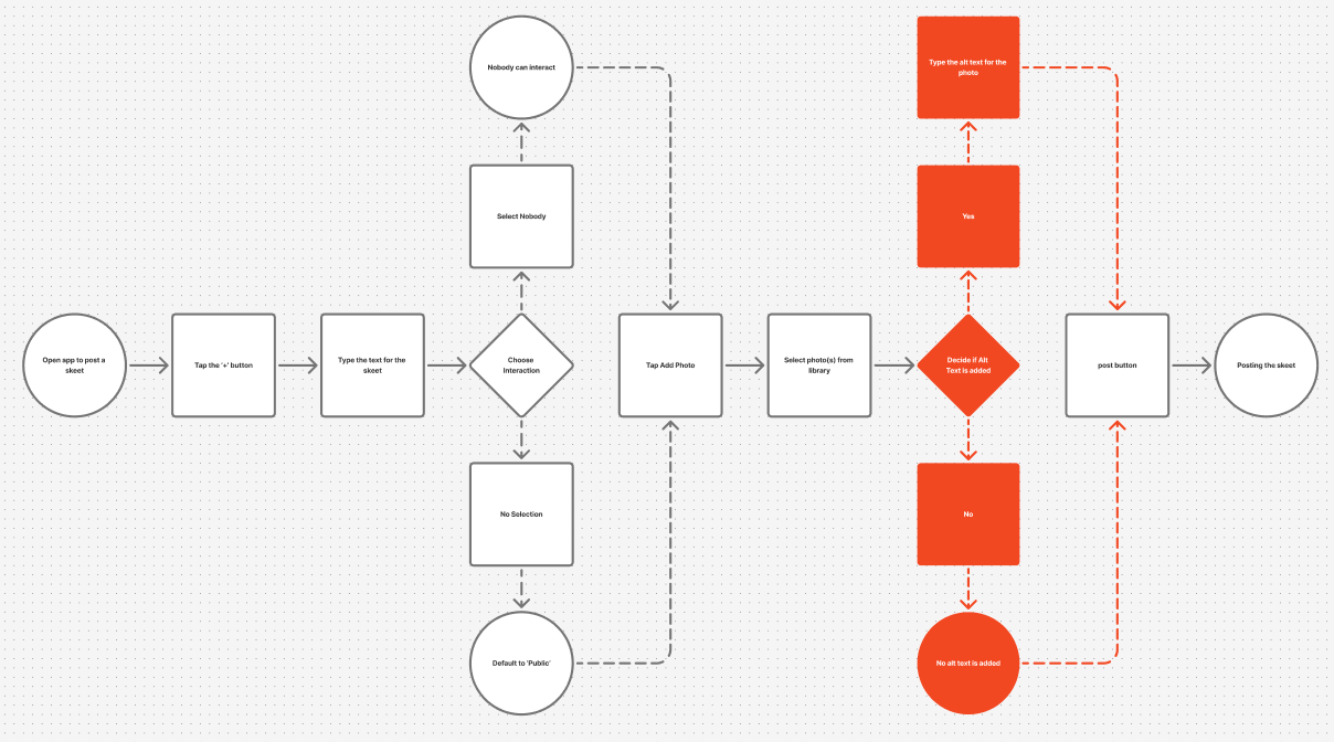
- Alt text is technically supported but easy to miss. Adding alt text requires spotting a small “alt” button on the image, which many new users are likely to overlook.
Design goals
- Make posting with alt text a natural part of the flow, not an advanced option.
- Streamline navigation and remove avoidable detours and hidden menus.
- Explain feeds in plain language and support discovery without leaving the app.
- Preserve familiar patterns from X so migrated users feel at home.
Who I designed for
To ground the redesign, I created a persona named Marisol Herrera, a community outreach coordinator for a small environmental nonprofit in Austin. She uses social media to promote events, recruit volunteers, and share local success stories, but doesn’t consider herself “tech savvy.” Complicated setup processes and unclear features are frustrating when she’s trying to quickly post updates between meetings and site visits.
Marisol values tools that “just work”: intuitive, reliable, and centered on people rather than algorithms or configuration. She is excited by the idea of Bluesky’s custom feeds and kinder communities, but she doesn’t want to learn to code or read dense documentation to benefit from them. As she puts it, “I shouldn’t have to learn to code just to make a simple feed for local volunteers.”
Process
The project unfolded in four main stages: evaluating the current app, defining a persona and scenario, mapping the existing user flow, and then prototyping a redesigned interface in Figma.
1. Evaluating the current app
I began with a structured evaluation of the Bluesky mobile app, documenting its history, major functions, and information architecture. I noted how the home timeline, messaging, notifications, and profile screens largely mirror X, while the feeds system diverges sharply and introduces confusion. This evaluation surfaced the three problem areas I ultimately focused on: feeds, navigation, and alt text.
2. Persona & scenario
Next, I created Marisol’s persona and a specific scenario: she has designed a digital flyer for a local community event and wants to post it on Bluesky with proper alt text so visually impaired users can access the information. This scenario aligned tightly with the course’s emphasis on accessibility and gave me a concrete lens for evaluating the posting flow.
3. Mapping the original user flow
I mapped Marisol’s path from opening the app to successfully posting an image with alt text. The original user flow diagram highlighted the friction point: after selecting an image, she is returned to the compose screen and must notice and tap a small “alt” button on the thumbnail to add a description. This single, easily missed step is where accessibility succeeds or fails.
4. Designing the new flow and prototype
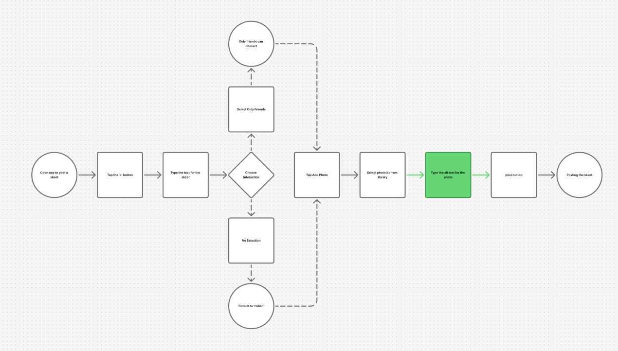
I then redrew the flow so that adding alt text becomes a default part of posting with images. In the updated flow, selecting an image triggers an intermediate screen that prompts the user to enter alt text before returning them to the compose view. In the Figma prototype, this appears as a focused modal with a clear label, helper text, and primary action, instead of a hidden optional control.
Key design decisions
1. Alt text as a first-class step
Instead of hiding alt text behind a tiny button, the redesign makes it an expected part of sharing images. After selecting a photo, users are immediately prompted to add a description, with the option to continue if there truly is nothing to describe. This reduces the cognitive load of “remembering” to add alt text and normalizes accessibility-minded behavior.
2. Streamlined navigation bar
I removed the hamburger menu and consolidated navigation into a more predictable bottom bar. A dedicated settings icon replaces the hidden drawer, making account controls and help content available from anywhere without the extra tap and visual jump to a separate menu. This mirrors patterns mobile users already know while reducing the number of “mystery meat” pathways in the interface.
3. In-app feed education & discovery
To address confusion around feeds, I redesigned the top bar so that the feed name itself becomes an entry point to a selector and simple feed builder, while a “?” icon opens an FAQ explaining what feeds are, how to follow them, and where to find more—all inside the app instead of on an external website. A general search icon replaces the old “#” button, which previously took users to a limited, single-purpose feed list.
Outcomes
Within the scope of the course, my prototype demonstrates a more coherent experience for new Bluesky users like Marisol. The updated flow removes a major accessibility pitfall, while the navigation changes and in-app FAQ give users clearer mental models for how feeds and settings work. Peer feedback in class highlighted that the design still “feels like Bluesky,” but surfaces help and accessibility in ways the current app does not.
If I were to continue this work, I would deepen the no-code feed builder so that non-technical users can define basic rules (“local posts,” “sustainability,” “mutuals only”) without ever touching developer tools or external sites.
What I learned
This project reinforced that giving users “more control” isn’t enough if the interface requires technical expertise to unlock that control. Designing for people like Marisol meant treating explanation, defaults, and accessibility as core parts of the experience, not add-ons. It also showed me how small interaction changes, like when you ask for alt text, can shift the culture of a platform toward more inclusive habits.
Interested in this project?